Advanced technologies for data management are an essential tool for ensuring informed decision-making. Data is usually created and reported from many different sources. Effective tools for synthesizing data improve accuracy, good analyses, and the ability to visualize what the data means, enhancing evidence-informed decision-making. Digital “interactive’” dashboards are one such tool, providing an excellent vehicle to visualize data. A dashboard can accurately summarize all the findings to properly communicate results to decision-makers.
ME&A has provided data collection, management, analysis, and visualization solutions for US Government missions operating units across the world through ESRI Geographic Information System (GIS) technology. Collecting primary and secondary socioeconomic and environmental data linked to US Government missions activities is of great importance, especially for monitoring, evaluation, and learning (MEL). Presenting data through interactive visuals (including maps and statistical graphics) allows US Government missions operating units to assess evaluation questions to better inform decisions for planning/programing activities.
By using web-based digital dashboards, ME&A has recently provided US Government missions with interactive tools for MEL purposes in El Salvador, Bangladesh, Tanzania, and Rwanda. These instruments are based on GIS technology and relate spatial data with context indicators, such as crime incidents, health facilities and services, schooling, irregular migration, forestry and agriculture, labor force, etc. The use of interactive maps linked to statistical graphics, such as bar charts and pie charts, has helped bring understanding to the spatial distribution of given indicators and how they performed over time. In this sense, US Government missions can make decisions for allocating resources and programming interventions in a manner that best provides solutions to countries’ challenges.
Following are a few examples of ME&A’s products that supported US Government missions’ decision-making in El Salvador, Bangladesh, Tanzania, and Rwanda.
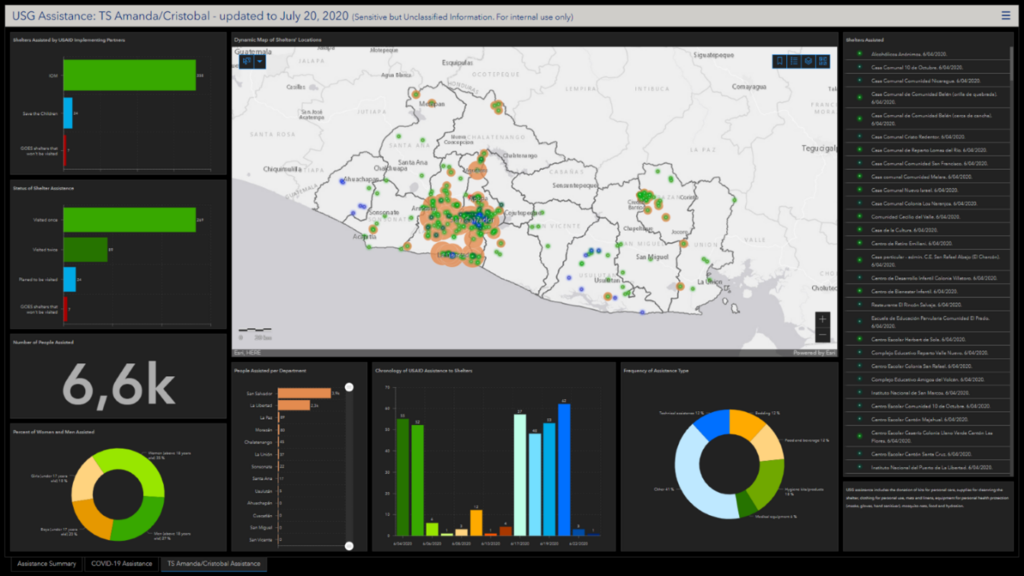
The US Government mission in El Salvador requested an interactive dashboard to visualize the distribution of humanitarian assistance provided to the Government of El Salvador to reduce the impact of tropical storms Amanda and Cristobal occurring consecutively in late May/early June 2020. The dashboard allowed users to quickly identify the impact of the provided assistance. Information included a map with the locations of where first-aid equipment and cleaning kits were delivered to shelters as well as charts summarizing beneficiaries supported and the amount of equipment implementing partners/NGOs directly delivered to communities in need. A timeline for distributing the assistance provided a view of the efficiency of delivering the aid. The dashboard was built the day after the second storm hit the country to build understanding of needs and optimize aid delivery during the emergency response.
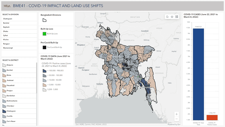
In Bangladesh, an interactive dashboard was requested by the US Government mission to determine the impact of the COVID-19 pandemic in built-up areas of the country. The information was shown at the country, division, and district levels to track land-use shifts according to the incidence of COVID-19 positive cases from 2021 to 2022 after the pandemic hit the country. The map included in the dashboard helped to visually identify those areas where the built-up loss was more frequent, coinciding with the districts that counted more than 10,000 COVID-19-positive cases.
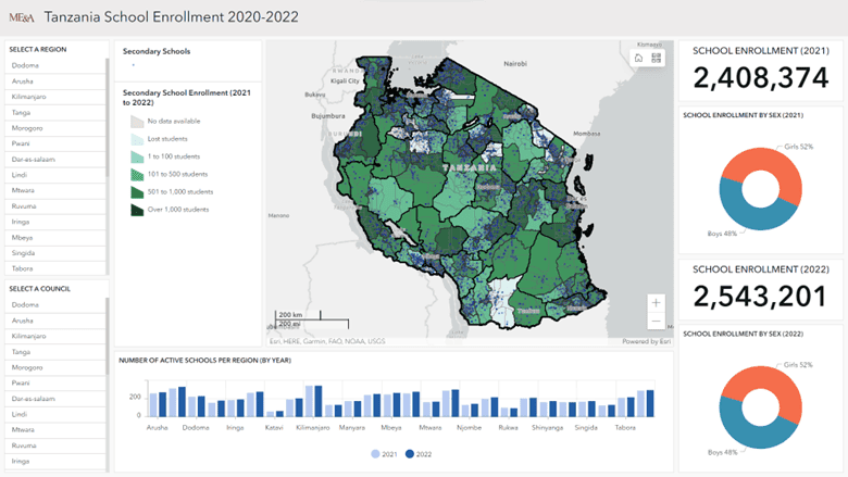
In Tanzania, ME&A built a dashboard of the secondary school enrollment between 2020 and 2022 as a visual instrument to understand the schooling coverage in that period. The information was disaggregated by sex for each year (school years 2020/2021 and 2021/2022) to evidence the difference between girls and boys who attended school. A map showed the spatial distribution of the school coverage in the country. The instrument was built as an example to show the capabilities of an interactive dashboard for visualizing context indicators needed by the US Government mission to inform the programing decisions.
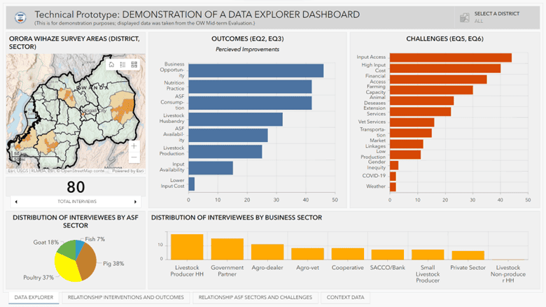
In Rwanda, dashboards developed by ME&A have been used for visualizing evaluation and assessment findings. Evaluation questions’ findings have been interactively displayed using bar charts linked to a map of the surveyed area. This helped US Government missions understand the coverage of the evaluation and the performance of interventions related to a US Government missions project that supports the nutrition and socioeconomic development in the country. Dashboard users can easily and accurately derive conclusions about the performance of the project’s activities and pinpoint where more support is needed.
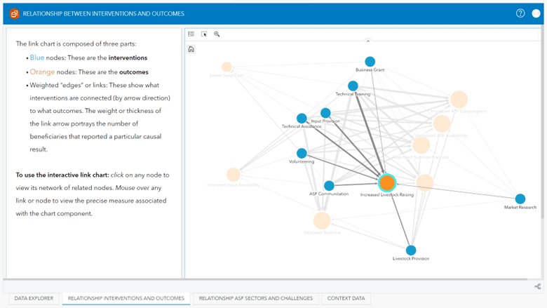
Digital dashboards also have provided US Government mission in Rwanda the opportunity to visualize interactive bivariate graphics to support decision-making based on analytical evidence. The use of link charts helped them understand the relationship between activities and the perception of achievements by beneficiaries. The example shows that “technical training” is the most essential activity to increase livestock raising as mentioned by the interviewees during an evaluation in Rwanda (the thicker the line represents a stronger relationship between nodes).
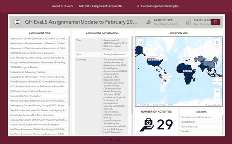
ME&A’s digital dashboards have been used for summarizing the results of initiatives across the world, such as the Global Health Evaluation and Learning Support Activity implemented by ME&A in support of the US Government missions Bureau for Global Health. In this case, dashboards are embedded into a web page interface, allowing maps and graphics to be mixed with text to help the viewer better understand the progress of the activity’s evaluations in different regions of the world.
ME&A through its home office and field offices worldwide is committed to continuing to support US Government missions decision-makers in improving evidence-based decision-making. We will continue to provide accurate data management and visualization to support US Government missions in making more effective decisions in allocating resources and programming interventions.